
Singapore River Festival
Website Design
Brand Strategy, Visual Identity, Landing Page
Website Design
The tenth-anniversary festival site, editable by the team running it.

Singapore River One is a non-profit managing the precinct spanning Boat Quay, Clarke Quay and Robertson Quay under URA's Business Improvement District programme, and runs the Singapore River Festival across all three every year. This year, 2026, was their tenth edition, themed The Quay Collective. They came with the key visual, copy and photography ready, and needed a five-page Squarespace site built to fixed festival dates.
Singapore River One is a non-profit managing the precinct spanning Boat Quay, Clarke Quay and Robertson Quay under URA's Business Improvement District programme, and runs the Singapore River Festival across all three every year. This year, 2026, was their tenth edition, themed The Quay Collective. They came with the key visual, copy and photography ready, and needed a five-page Squarespace site built to fixed festival dates.
Last year's site pointed to a few things they wanted to change. The pages were long and dense with stakeholder cards, merchant grids, sponsor logos and event listings, and the content kept moving, including during the ten days the festival was live. Their team had been going back to a developer every time a table needed editing.
So the site had to hold a lot of material and still be safe for non-designers to touch under pressure.
So the site had to hold a lot of material and still be safe for non-designers to touch under pressure.
What SRO came with: ten activations across three quays; events with anywhere from seven performers to none; fifty-five promotions; a MONOPOLY scavenger hunt and a fixed-date heritage tour, each needing its own page. On top of that, SRO wanted people arriving from Instagram or a Google ad to land directly on the quay or activation the ad was about, not a generic homepage they'd have to search from.
What SRO came with: ten activations across three quays; events with anywhere from seven performers to none; fifty-five promotions; a MONOPOLY scavenger hunt and a fixed-date heritage tour, each needing its own page. On top of that, SRO wanted people arriving from Instagram or a Google ad to land directly on the quay or activation the ad was about, not a generic homepage they'd have to search from.
So the bulk of our work was deciding what each piece of content was for,
So the bulk of our work was deciding what each piece of content was for,
then giving it the smallest structure that would let it do that and be linkable on its own.
then giving it the smallest structure that would let it do that and be linkable on its own.

Colour was already how SRO signalled the precinct.
Colour was already how SRO signalled the precinct.
Each quay has its own identity in how they run the festival day to day. We carried that into the site: one colour per quay, applied across navigation, event tags, the map and the promotions list, so visitors could make the connection at a glance.
Each quay has its own identity in how they run the festival day to day. We carried that into the site: one colour per quay, applied across navigation, event tags, the map and the promotions list, so visitors could make the connection at a glance.

The three quays are organised as tabs on the Explore page,
The three quays are organised as tabs on the Explore page,
rather than three separate pages or one long scroll. A visitor picks Boat Quay, Clarke Quay or Robertson Quay and sees the activations, performers and timing that belong to that quay. Each tab can be linked to directly from outside the site. It keeps three different neighbourhoods from blurring into one undifferentiated feed.
rather than three separate pages or one long scroll. A visitor picks Boat Quay, Clarke Quay or Robertson Quay and sees the activations, performers and timing that belong to that quay. Each tab can be linked to directly from outside the site. It keeps three different neighbourhoods from blurring into one undifferentiated feed.
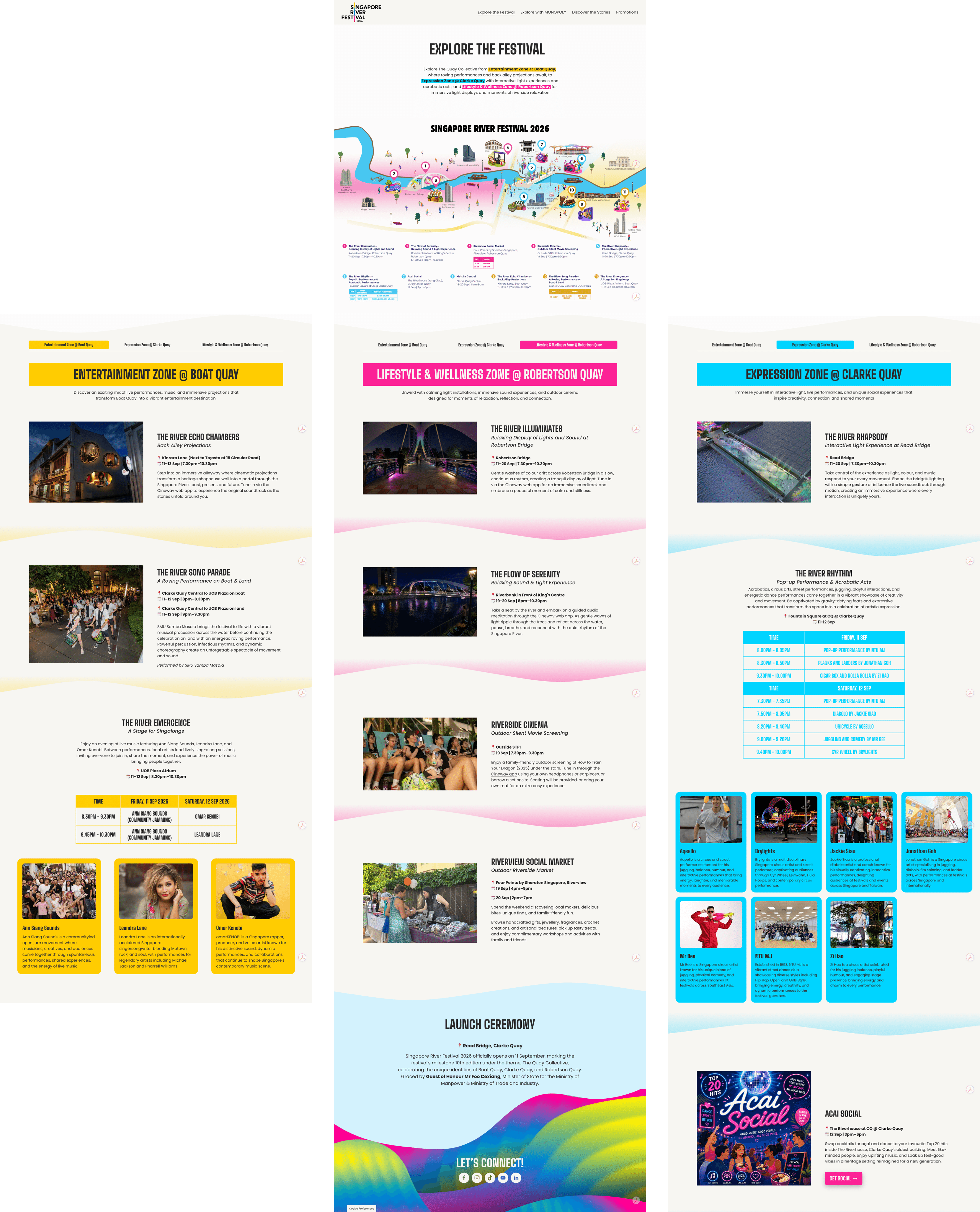

Promotions run alphabetically with a jump bar rather than pagination, because someone standing outside a shop mid-festival is looking something up rather than browsing.
24,753
24,753
pageviews on Explore the Festival
pageviews on Explore the Festival
pageviews on Explore the Festival
4m 05s
4m 05s
average time on page
average time on page
average time on page
18.8%
18.8%
Campaign links from social & ads converted
Campaign links from social & ads converted