NNT Fitness
Repositioning a fitness coach as the health educator he already was.
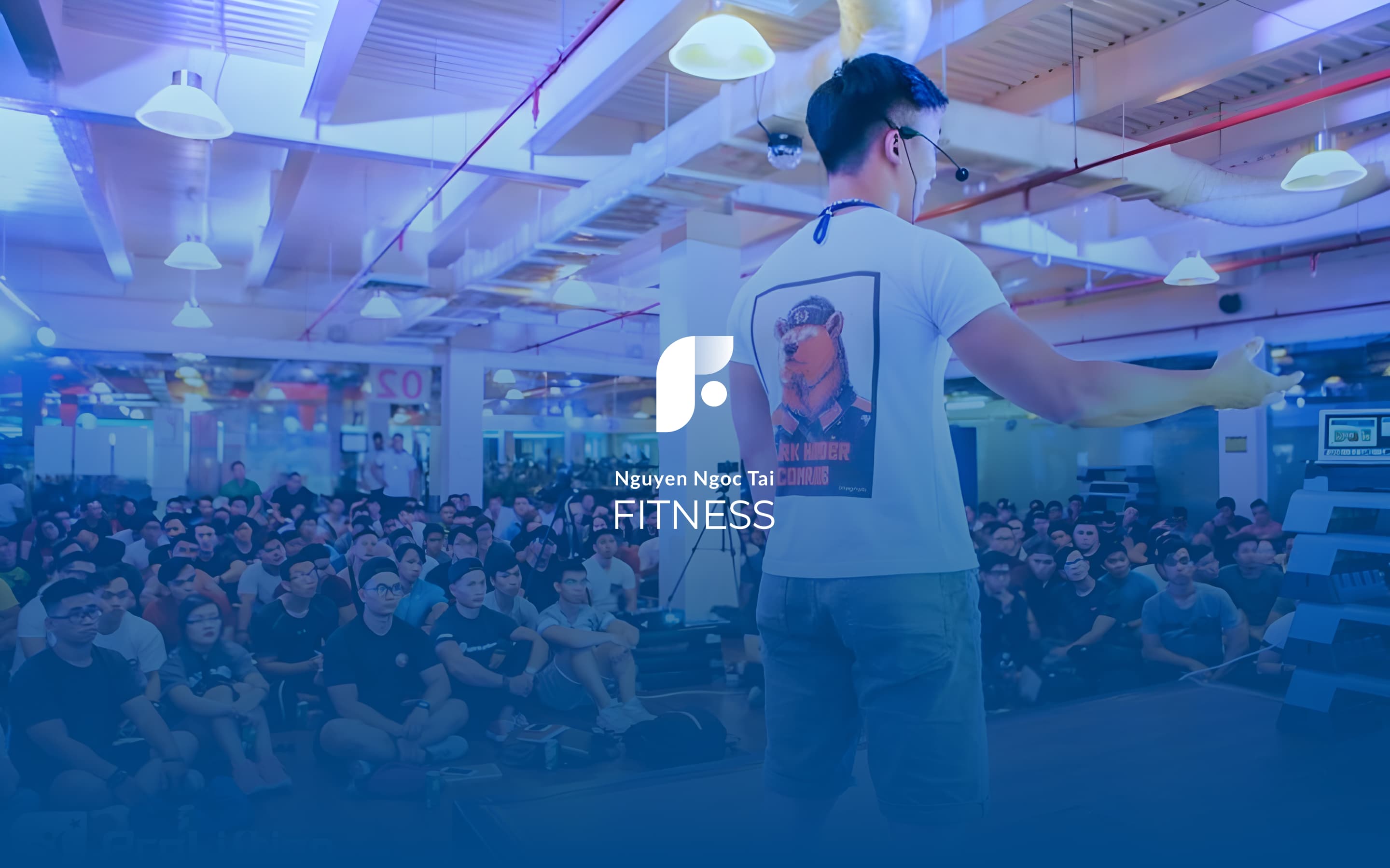
Tai Nguyen had been building for years: courses, books, nutrition programs, a following that trusted him to simplify the overwhelming volume of fitness information available to Vietnamese audiences. This is undoubtedly more than a coaching practice.
But he has been positioning himself as a personal trainer.
There is a gap between what he was doing and how he appeared.


The fitness industry defaults to intensity:
Hot colors, aggressive typography, before-and-after logic. Every competitor in the landscape was speaking the same visual language.
Tai's approach was the opposite: calm, structured, knowledge-first. Someone who treats clients as people capable of understanding, not just following instructions.
The visual identity had to reflect that difference.
The logo fused three ideas that Tai delivers: a healthy body, a productive mind, and sustainable growth. We chose blues and greens instead of the usual red and orange, calm over intensity.


Three service categories needed to be defined clearly enough that a visitor could immediately understand where they sat: Courses, Coaching, Resources. Each with its own content logic, its own audience, its own entry point.
The tone we went with was a knowledgeable friend, not a salesperson. Someone who genuinely wants to help you understand, not just sell you a program.
The structure was built to grow (new courses, new products, new content) without requiring a redesign every time something changed.

"Khanh actively listened, provided specific feedback, and excelled in understanding our brand ethos. One standout aspect was her copywriting. Even though she's not from the fitness industry, it was very well done and completely unexpected."
Tai Nguyen, Founder, NNT Fitness