Merly Roastery
A symbol he'd carried for years, reframed into a system.
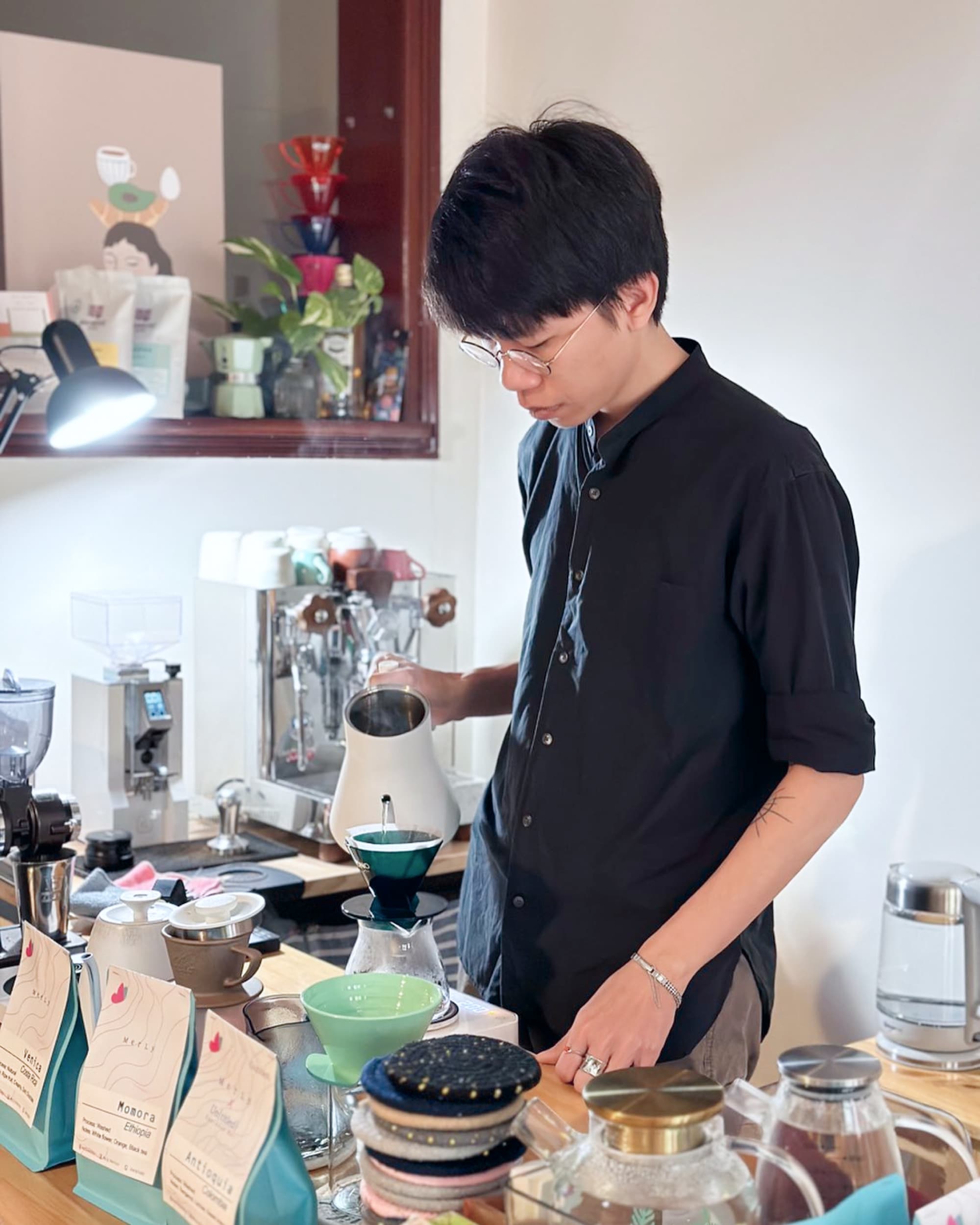
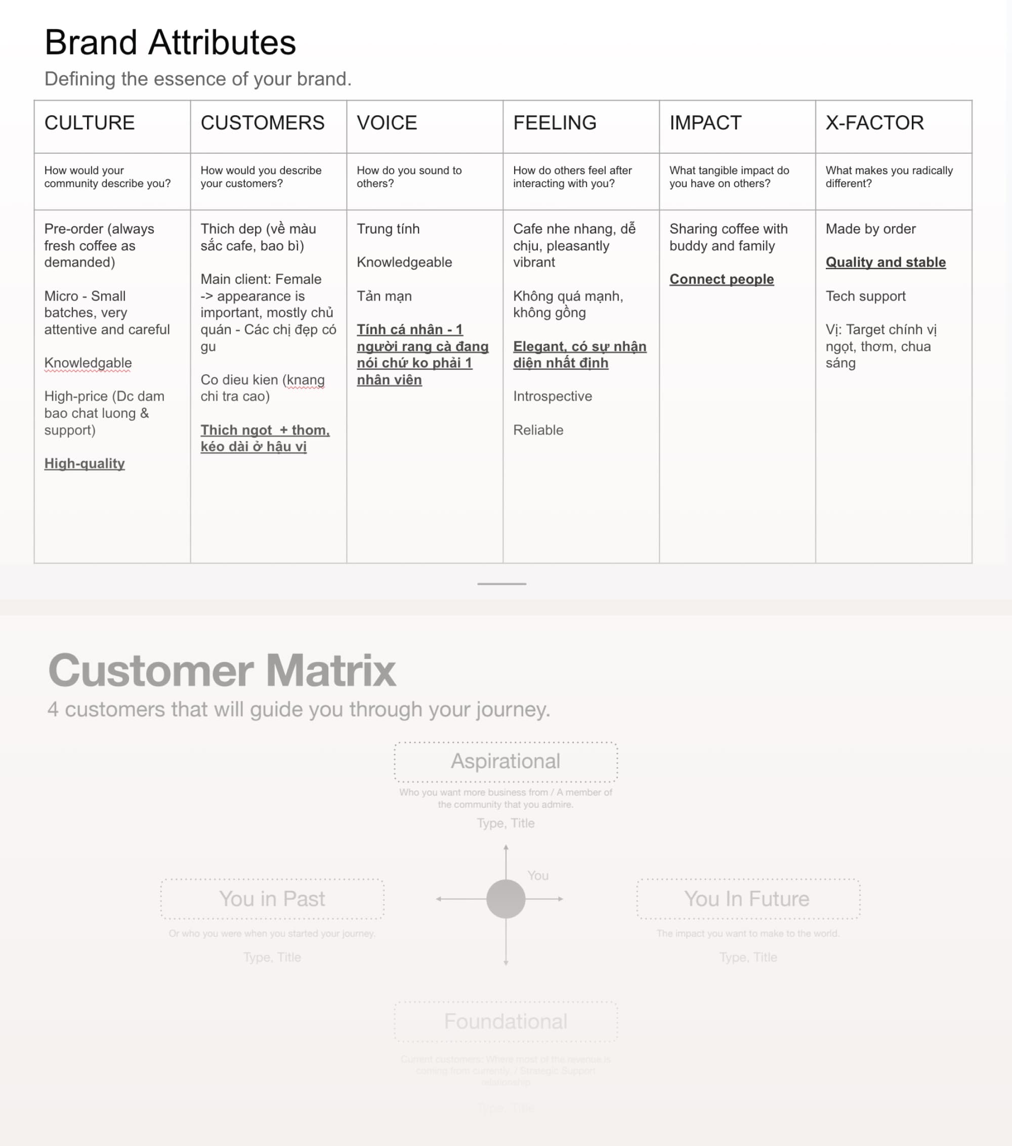
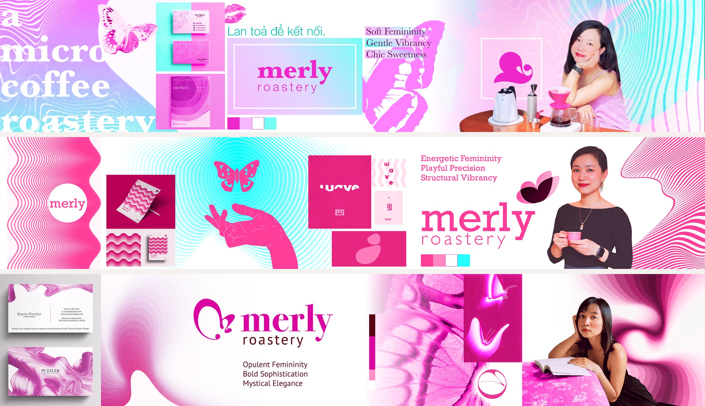
Duy had been running Merly Roastery for nearly five years when the work began: supplying high-quality, light-roast beans to cafés and home brewers who care about flavor over intensity.
He had a philosophy, a following, and a clear sense of what his coffee felt like to drink.
What he needed was a visual language precise enough to carry it.
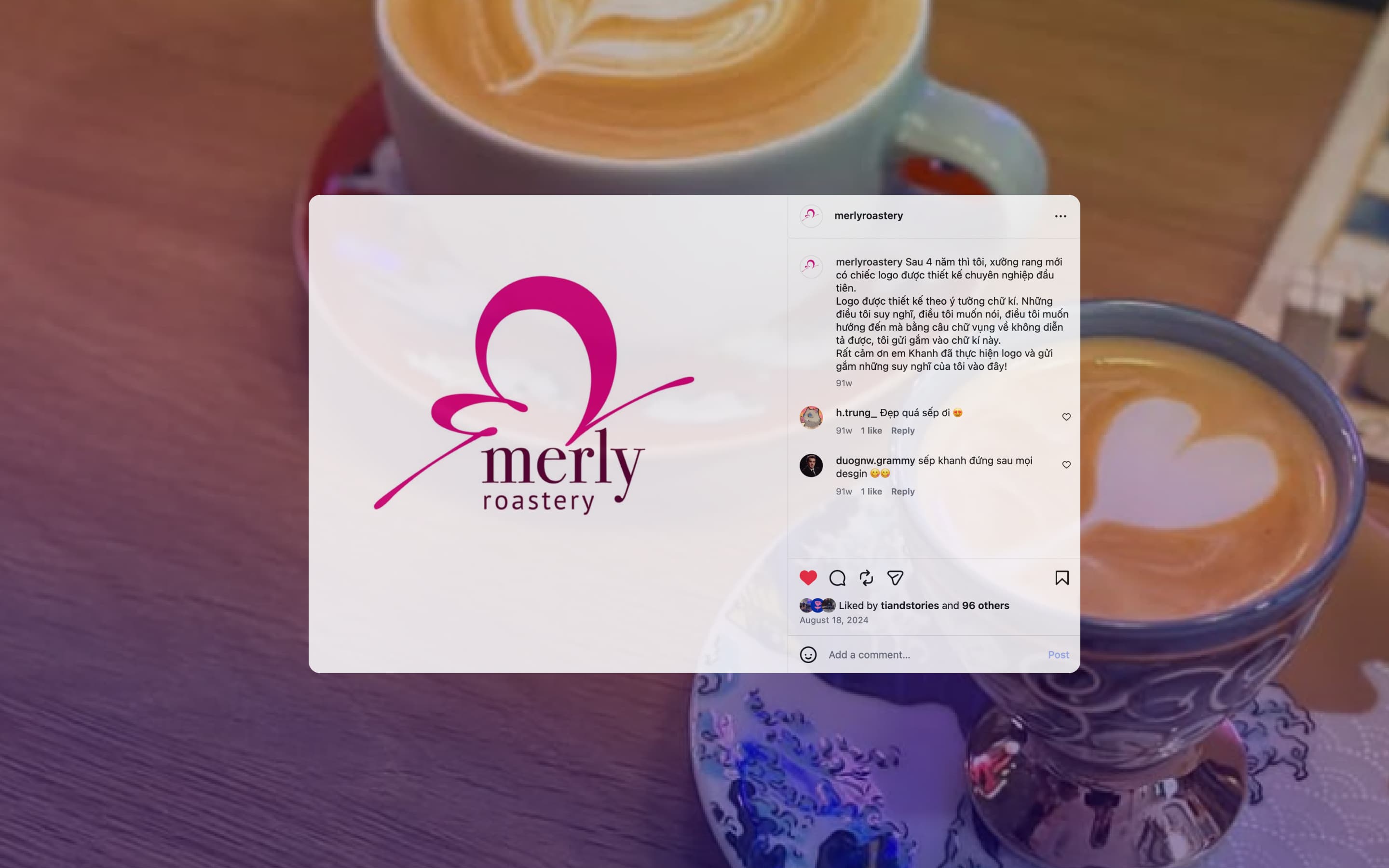
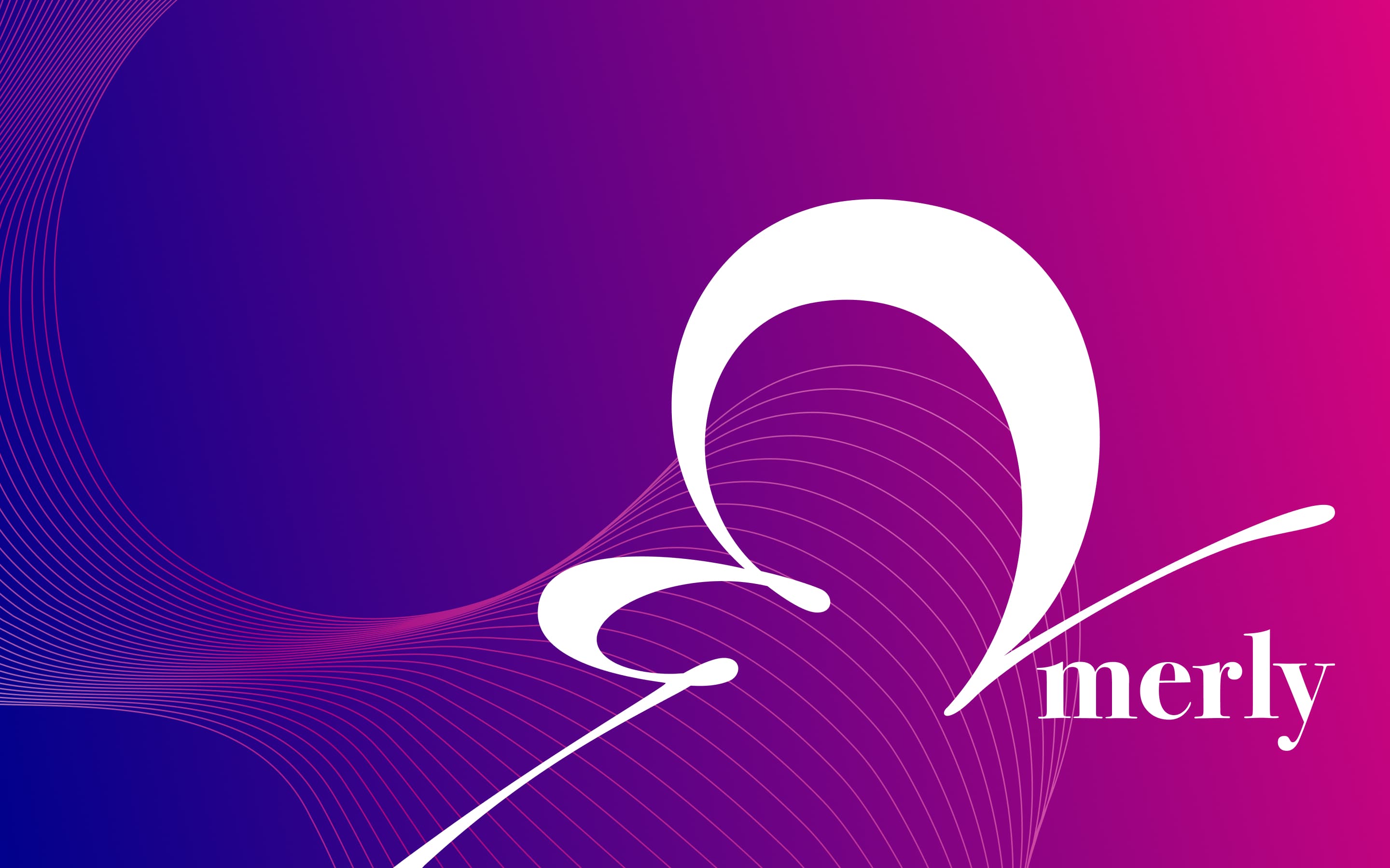
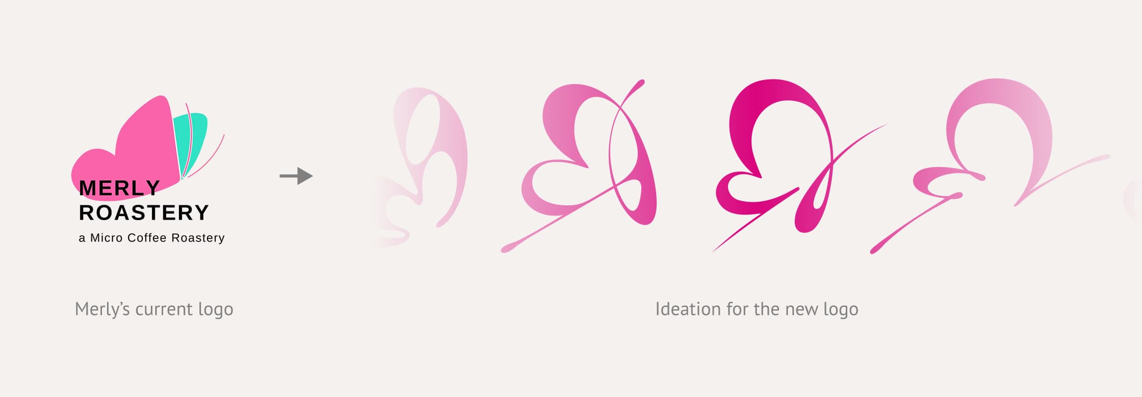
In the first conversation, he mentioned the butterfly,
then immediately walked it back, saying: "It doesn't have to be a butterfly, I just like what it represents."
I pushed back, because if a symbol stays with you for years and still resonates, it must mean something. We kept it and reframed it not just as a butterfly, but the butterfly effect: one good cup of coffee radiating outward into the day, into the people around you.
Light roast is Duy's philosophy, not just a product category.
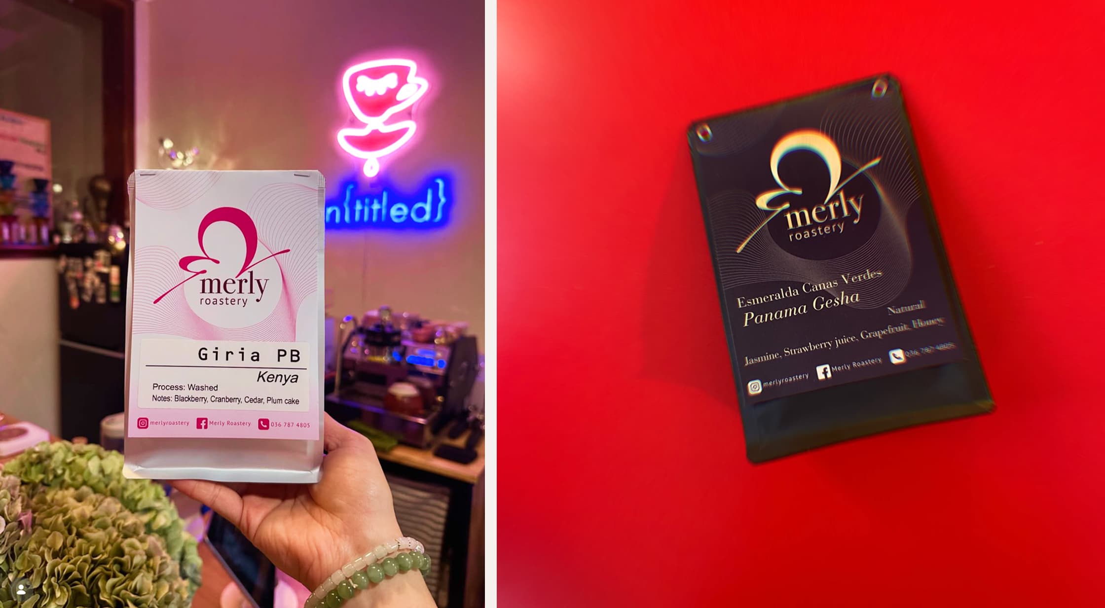
The packaging became a perception system.
Espresso beans for cafés: deep, rich hot pink signaling strong, concentrated, professional qualities.
The pour-over line: white for the everyday accessible range, deep navy for the premium single-origin selections.
A gold and black edition for the very top tier.
No price tag needed because the color already does the signaling.
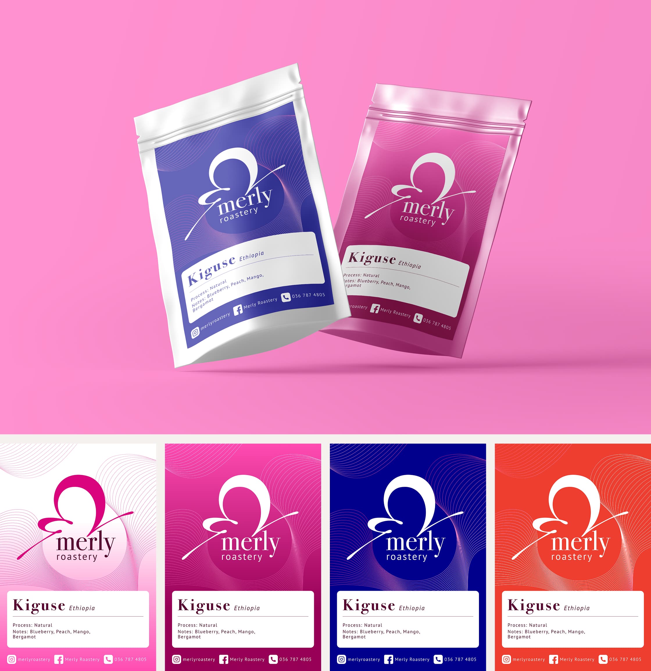
When the bags sit together on a café shelf, Duy described it as a kaleidoscope of butterflies.
"Working with Oh Mai! Design was a rewarding experience. Their clear and methodical approach alliviate all confusion. The result was an increase in both brand recognition and overall professionalism, something we're incredibly proud of."
Duy Nguyen, Owner, Merly Roastery